
That being said, I still want a brief that focuses on icon design - it just needs a purpose. A few suggestions from the discussion with Phil was to propose instructions, create a visual dictionary, create a visually pleasing map of Leeds or use children's books to tell a story with just icons. All good ideas, but choosing the right one for me is crucial.
I decided to use this opportunity to research projects that have used icon design for a purpose, and why they're so successful.
---


The icons used for this project are there to categorise information, based on photographs of the subject. They're simple, one colour, and work as a set. This is a direction that I could take, simplifying a group of photographs into icons, to promote a cause.
---


The icons in this informative poster are used to back up the info graphics and visually represent the subject being analysed. For example, male & female, ambulance, death etc. It is important to note the colour scheme also, it is kept to 3 main colours - yellow, orange and red, all part of the warm colour spectrum; something to consider if I were to create an informative poster.
The project also demonstrates the transferability of an informative poster, such as this, from print to web. Another outlet for the information to be featured.
---

Another form of iconography is that of the logo. Examples of these come in simplified form to represent the world of social media. These are designed for the web, in particular the favicons for the websites, which have to be 16x16 pixels - they need to be recognisable.
---

This is an interesting icon - it has a certain visual quality to it that separates it from the standard icons seen in everyday situations. The lines don't meet, the fork is disjointed from the handle, the knife is just a rod with one straight edge. BUT, it is absolutely clear what it represents. It is interesting to see what is recognisable once you push the boundaries of visual accuracy. Food for thought...
---
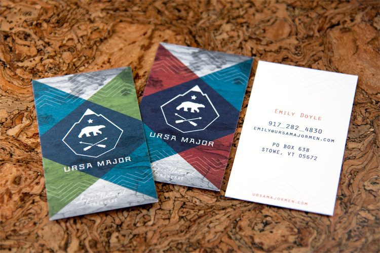
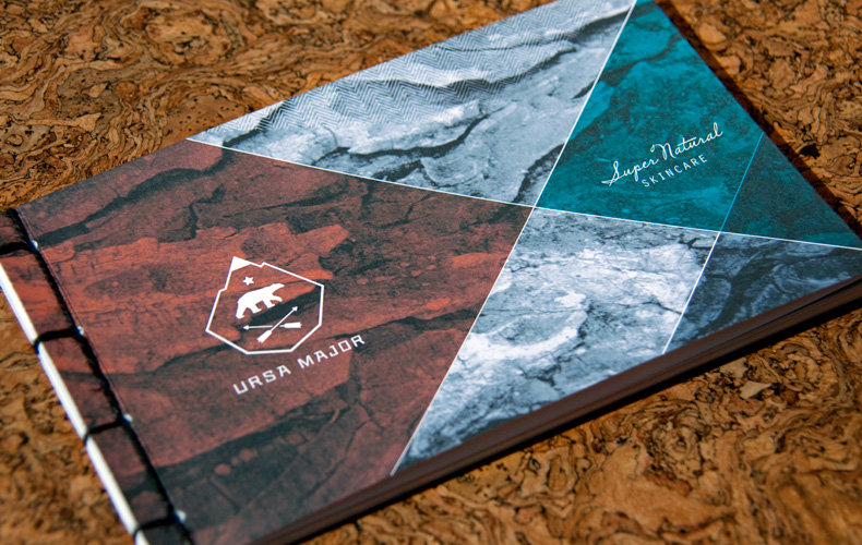
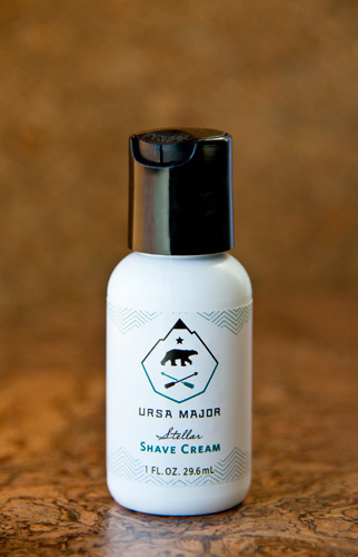
Yes, this is technically branding. But, logo design is directly linked with iconography and this is a great example - 4 simple icons combined to make an identity. Mountain, star, bear, arrows. The company is branded to reflect the star constellation "Ursa Major" hence the name. The other two icons are there, probably to communicate the outdoors, freshness and nature - especially with the mountain range. After all, it is a skincare range and the sole purpose of the products is to treat and freshen the skin.
A good combination of icons to create identity, and an example of 4 simple, yet incredibly recognisable, pieces of iconography.
---
No comments:
Post a Comment